

Introduction
Custom components provide a flexible and highly customizable way to introduce your own React components for the C1 API to use in its responses. Custom components unlock a lot of tailor-made interfaces that your application might require, and it can now work within C1.
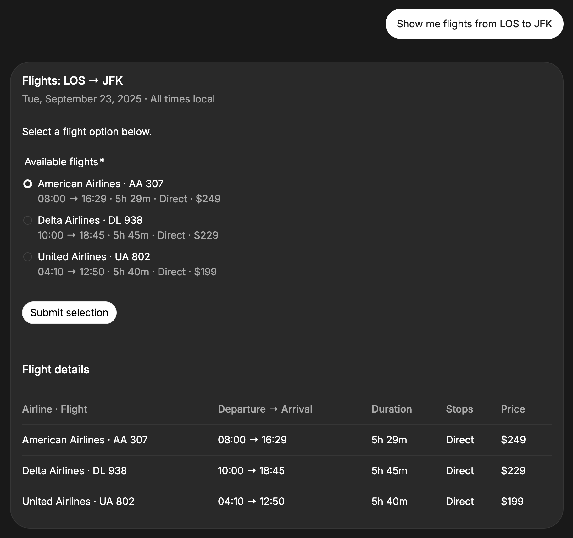
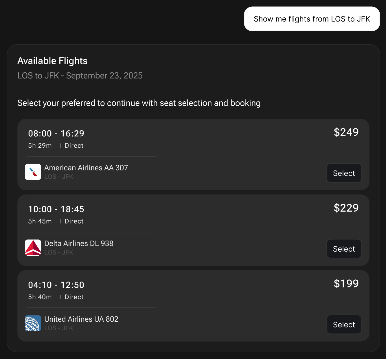
To illustrate the usefulness of custom components, imagine a flight booking service uses the C1 API to enable generative UI for its users.
The user has asked for LOS to JFK flights on September 23, 2025. With the existing C1 components, the information is presented to the user in a C1 Form for selection.
Integrate Custom Components
The following is a step-by-step guide on how to plug in your React components, along with instructions for C1 to use them in its generations.For a working example, kindly visit Thesys C1 examples on
github
1
Define your React components
Use
@thesysai/genui-sdk’s useOnAction to get an onAction callback.
This callback is used to handle user interactions with components.
In addition to onAction, each component can have its own internal functions for useC1State management, API fetching, etc.Use useC1State to maintain per-response state of the component within C1.Refer to Custom Components Specification below for more details.src/app/components.tsx
2
Define the component prop schema
In order to inform C1 about the expected props for your component, start by defining a
Zod-based schema.src/app/api/chat/route.ts
3
Pass the schema to the C1 API
Using the schema described above, convert them as
JSON schemas and send it as a part of your C1 API payload.src/app/api/chat/route.ts
Custom Component Specification
useOnAction
Returns a callback to record a user action with both a user-facing label and an LLM-oriented description. Returns(humanFriendlyMessage: string, llmFriendlyMessage: string) => void
Callback to dispatch the action.
string
required
Visible to the user; concise, human-readable label for the action. Used to
give feedback to the user about their action.Eg: When submitting a form for a trip planner, the human-friendly message can be “Submit response”.
string
required
Sent to the LLM; richer context describing what happened. Used to send the
contents of the user action to the LLM.Eg: When submitting a form for a trip planner, the LLM-friendly message can be “User selected
${form.destination}, from ${form.startDate} to ${form.endDate}”.Refer to Interactivity for
more details on
onAction, and how human-friendly and llm-friendly
messages work.useC1State
Access a named piece of component state with getter and setter helpers. Argumentsstring
required
The state field key you wish to read/write.
() => any
Function that returns the current state for the given
name.(value: any) => void
Updates the field and triggers any save/persist callbacks.